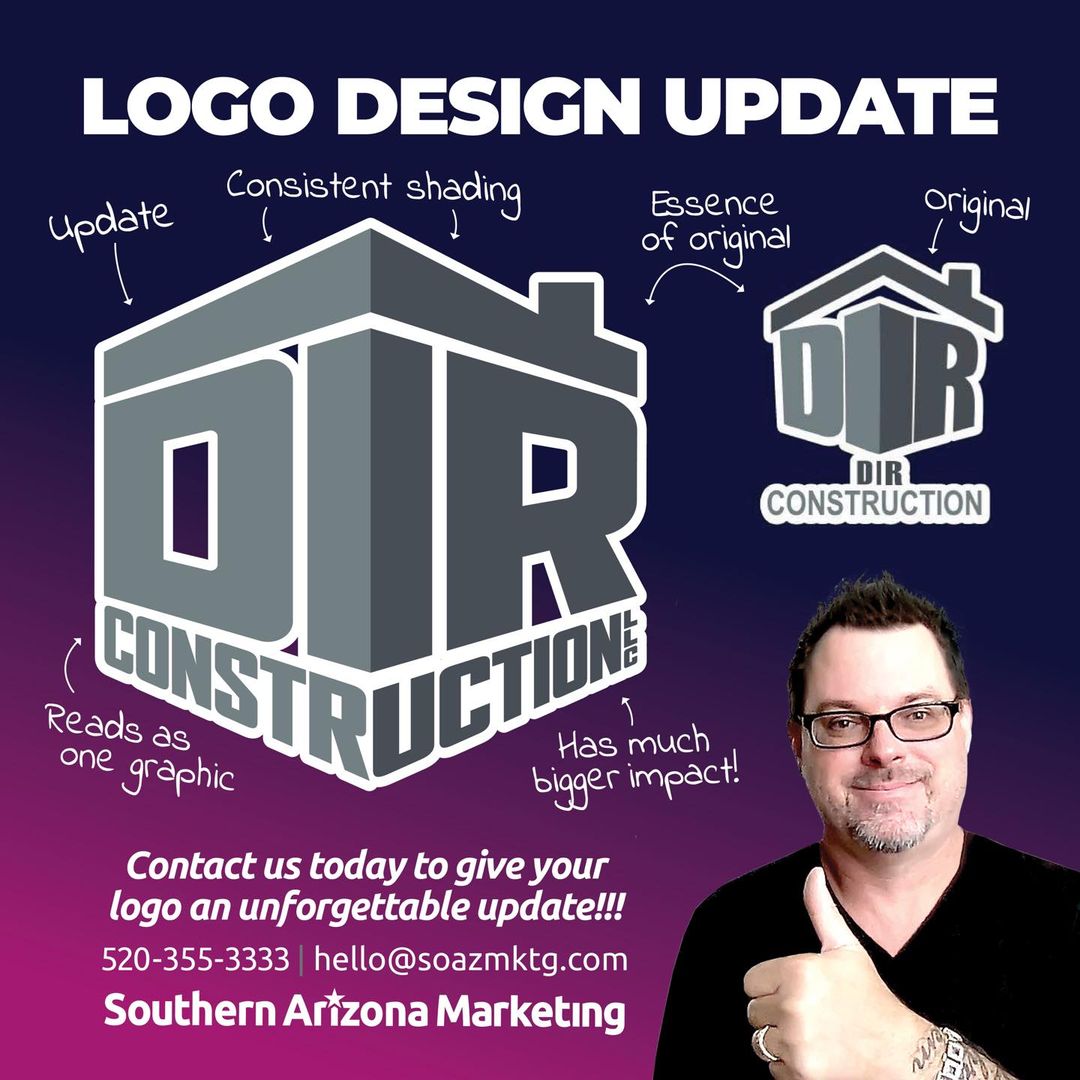
A little touch up can go a long way and we can do it! Here’s a recent one we did for our friends at DIR Construction. Their original logo was actually pretty good, utilizing a great concept that psychologically tied it to their industry of construction. Conceptually it also invokes a hint of being a cornerstone, a symbol of strength, that unfortunately it did not quite pull off and it’s all a little hard to read.
So we got to work! First we just tightened everything up into a cube. It’s one of the best shapes for logos as it’s compact, strong and also suggests movement or action because of its dimension. From there we focused on readability and with a few more graphic tricks and finesse it all came together nicely.
Call/text me Sebastian directly at 520-355-3333 or send me a message to give your logo an update today!!!


